During Summer 2022 I worked at a startup called Republic whose mission is to democratize private investing. Because I had worked in their traditional VC branch before, I was excited about supporting the goal of opening up investing to more people as usually you need to be a high net worth individual to invest in a start up. That summer I worked on 3 main projects: user dashboard, search and privacy settings.
Summer 2022
Product Design
Figma
Product Design
Figma

Project 1: User Dashboard
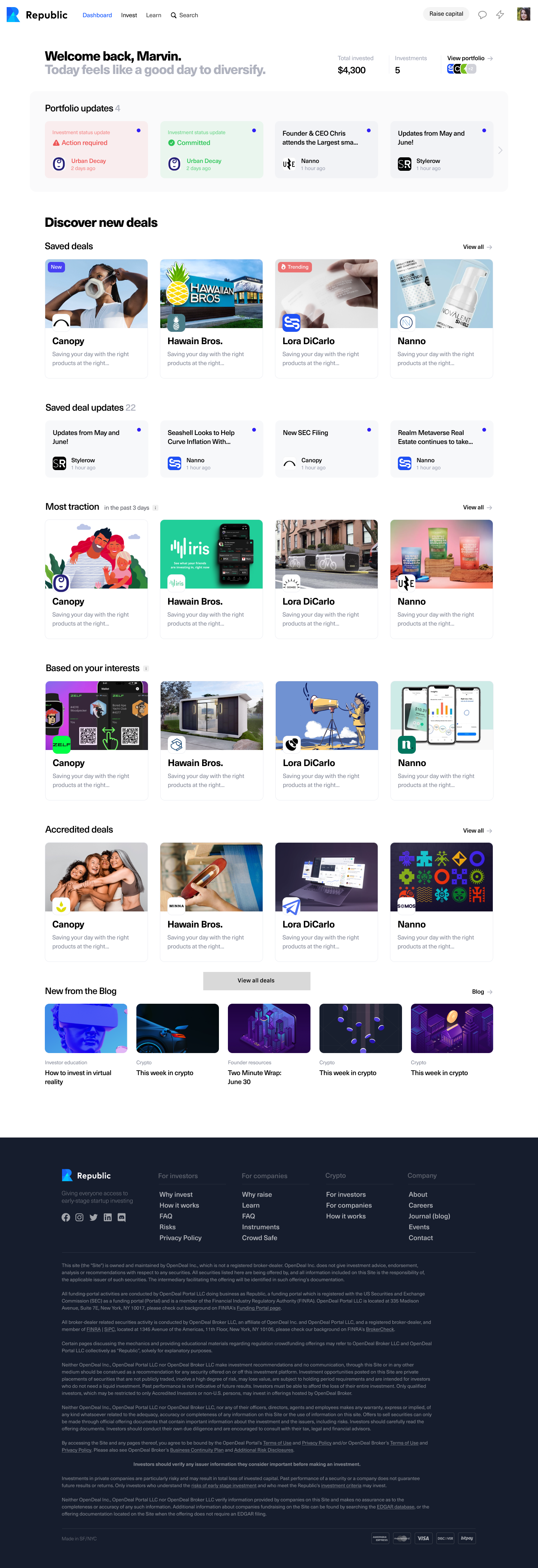 Final Draft of User Dashboard
We had two main iterations we were testing, one with a single column view, and one with a two-column view, where the portfolio overview would be in a sidebar.
After testing, it seemed like users did not have a strong preference towards either the one or two-column views. They did however emphasize how they like seeing their portfolio and that they would like to see updates from their portfolio on this dashboard. They also found the dropdowns a bit confusing. One user mentioned that the functionality of the dropdowns was cool, but we were probably over-engineering and it was enough to just have rows of deals that may be interesting to them. Everyone seemed to like the new education center.
After user-testing, as well as discussing with internal stake-holders, we decided for our V1 we would do a one column design, get rid of the dropdowns, and add the ability to see various relevant updates on your home page. We originally made a version with a larger portfolio view since a lot of the users seemed to like the idea, then updated our dashboard to go with the direction of the undergoing rebrand. However, all of their investments to discover would be too low on their dashboard and not show until they scroll, so we ended up compressing the portfolio section.
One issue we encountered was how best to differentiate updates related to a user’s portfolio companies from a user’s saved companies. We ended up putting the updates from saved deals in a separate space so it was clearer which updates pertained to which section (saved or portfolio).
We made a couple versions with cosmetic differences, and after talks with our head of product, came up with a final version to be implemented.
I helped design and test the new User Dashboard. Currently, on the Republic website, users see the same homepage whether or not they are logged in. The current homepage consists of a landing page with a call to action button to “Discover Companies.” When you scroll, you see an endless feed of investment opportunities, which can be overwhelming. With the new dashboard, we wanted logged-in users to have the ability to see content relevant to them, especially now that our onboarding process includes selecting categories that users are interested in. We also wanted to display educational content so our users feel more comfortable using the platform and making investments, as well as show articles from our blog.
We started by thinking through what elements we wanted the dashboard to have, taking into account some previous surveys we had sent to investors. I made some initial layout mocks and we went from there to make different iterations to test. My mocks displayed an education center at the top, then had various sections such as “Trending” and “Live Deals” where users could browse deals that may be interesting for them. My designs also featured drop-downs that users could use to sort their results to be based on their previous investments if they already had a portfolio or based on their categories that they selected during onboarding. If they had no portfolio or categories selected, but chose to filter with this option, they would be prompted to make an investment to fill their portfolio or select categories that are interesting to them.
We added a section where users could see their portfolio on their homepage, as we had previously heard feedback that most users who had already made an investment on Republic commonly check their portfolio to see if anything has changed with their investment(s). We also made a section where investors could see their saved deals, since they may be interested in investing in those in the future.
After we polished the mocks, I made Figma prototypes for user testing. We were curious if users found the ability to see companies based on their categories useful, and which of the sections were particularly interesting to them (Trending, New, etc). Additionally we wanted to see if users found the educational content helpful/relevant.

User Dashboard Draft -- Two Column Version
Project 2: Search

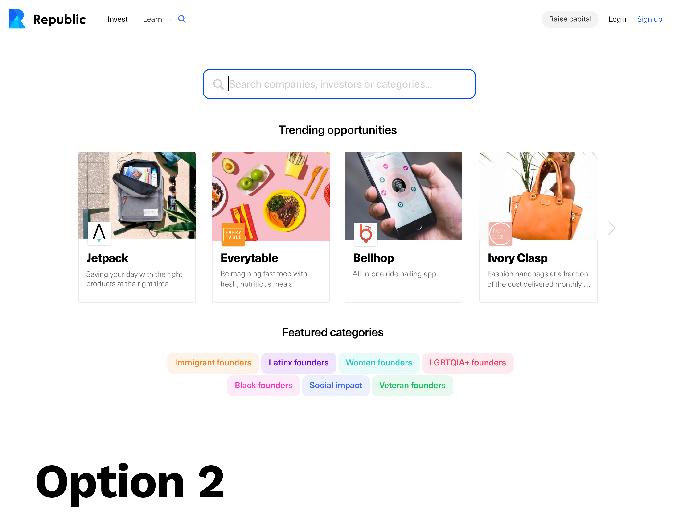

In the final version we show trending opportunities (companies) and popular categories before a user starts typing because if a user is new or just doesn’t know what to search, this will provide them some options of what they can look for. When a user starts typing we will show the most relevant results within opportunities, categories and investors. When clicked on, the results will open in a new page, so the user can look at multiple results without losing their spot. If the user’s search does not return any results, we will show them the same opportunities and categories as before they searched and additionally allow them to fill out a form if for some reason our results did not return what they expected.
I worked on a new search interface we call Global Search. The previous search on Republic only allows users to search for companies by name and by adding certain filters like “Sector” and “Revenue.” We wanted to give users a way to not only be able to search companies but to also search for relevant categories and investors that may be interesting to them. Our overall goal was to make search more focused on discovery. My work mainly involved conducting internal user tests with prototypes I made in Figma and working with our lead designer to implement the feedback we received while making sure the designs aligned with our goal of increasing deal discovery with the implementation of Global Search.
One of our limitations was not being able to implement a search in the header of the website, so we came up with some other options that would have the search experience on a separate page. One option did not have the header after the user navigated to search for a more “focused search” experience. The 2nd option had the header and then had a large search bar, while also having big images for the companies displayed before you search. The 3rd option had the header and the search bar, but again was a bit more of a focused search experience, with smaller thumbnails for the companies. After some internal testing, we noticed most people were drawn to option 3 because they did not feel overwhelmed by information and visuals, and they could easily navigate to anywhere else on the Republic site from this option.
![]()
![]() Final Search Designs
Final Search Designs
One of our limitations was not being able to implement a search in the header of the website, so we came up with some other options that would have the search experience on a separate page. One option did not have the header after the user navigated to search for a more “focused search” experience. The 2nd option had the header and then had a large search bar, while also having big images for the companies displayed before you search. The 3rd option had the header and the search bar, but again was a bit more of a focused search experience, with smaller thumbnails for the companies. After some internal testing, we noticed most people were drawn to option 3 because they did not feel overwhelmed by information and visuals, and they could easily navigate to anywhere else on the Republic site from this option.
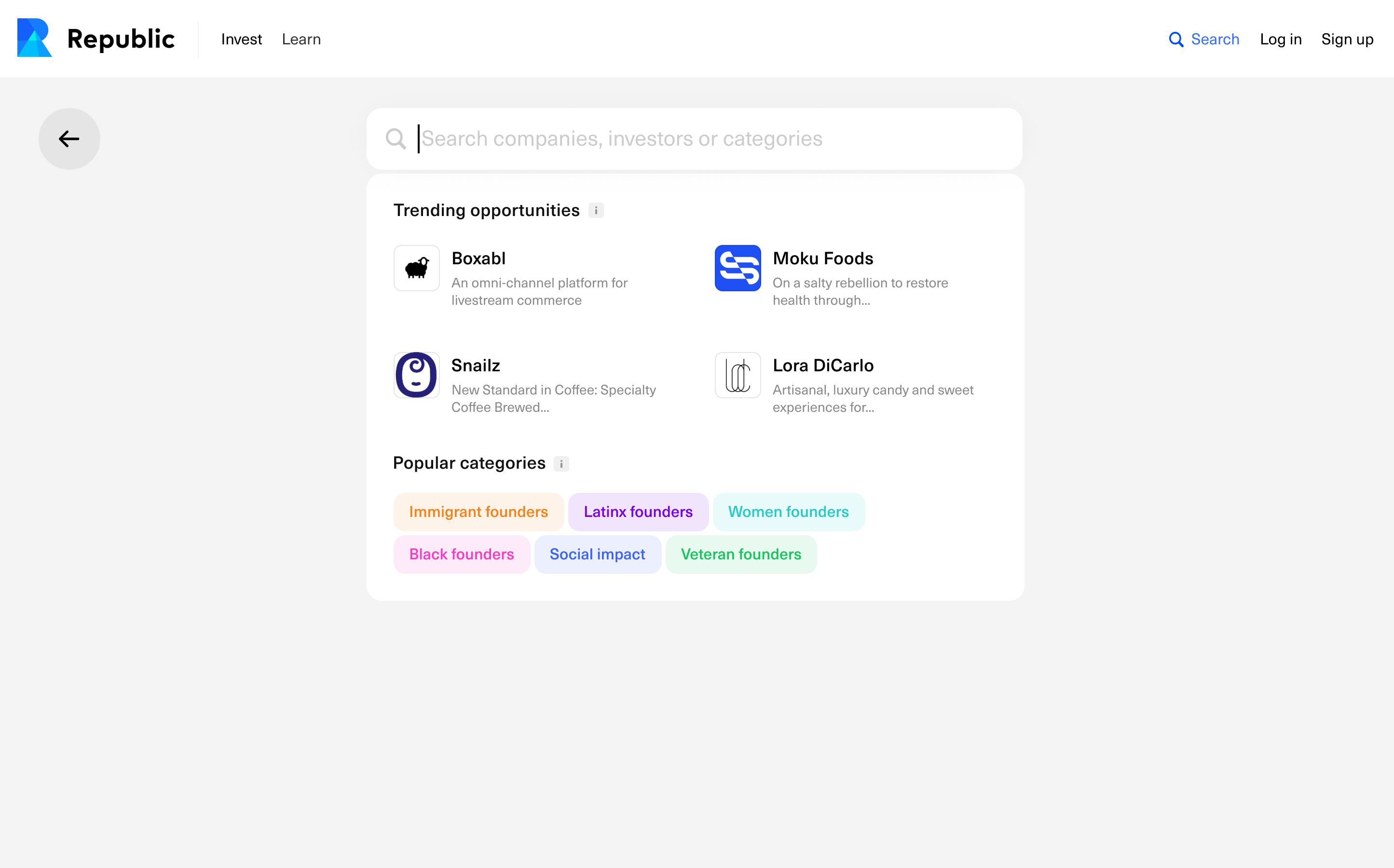
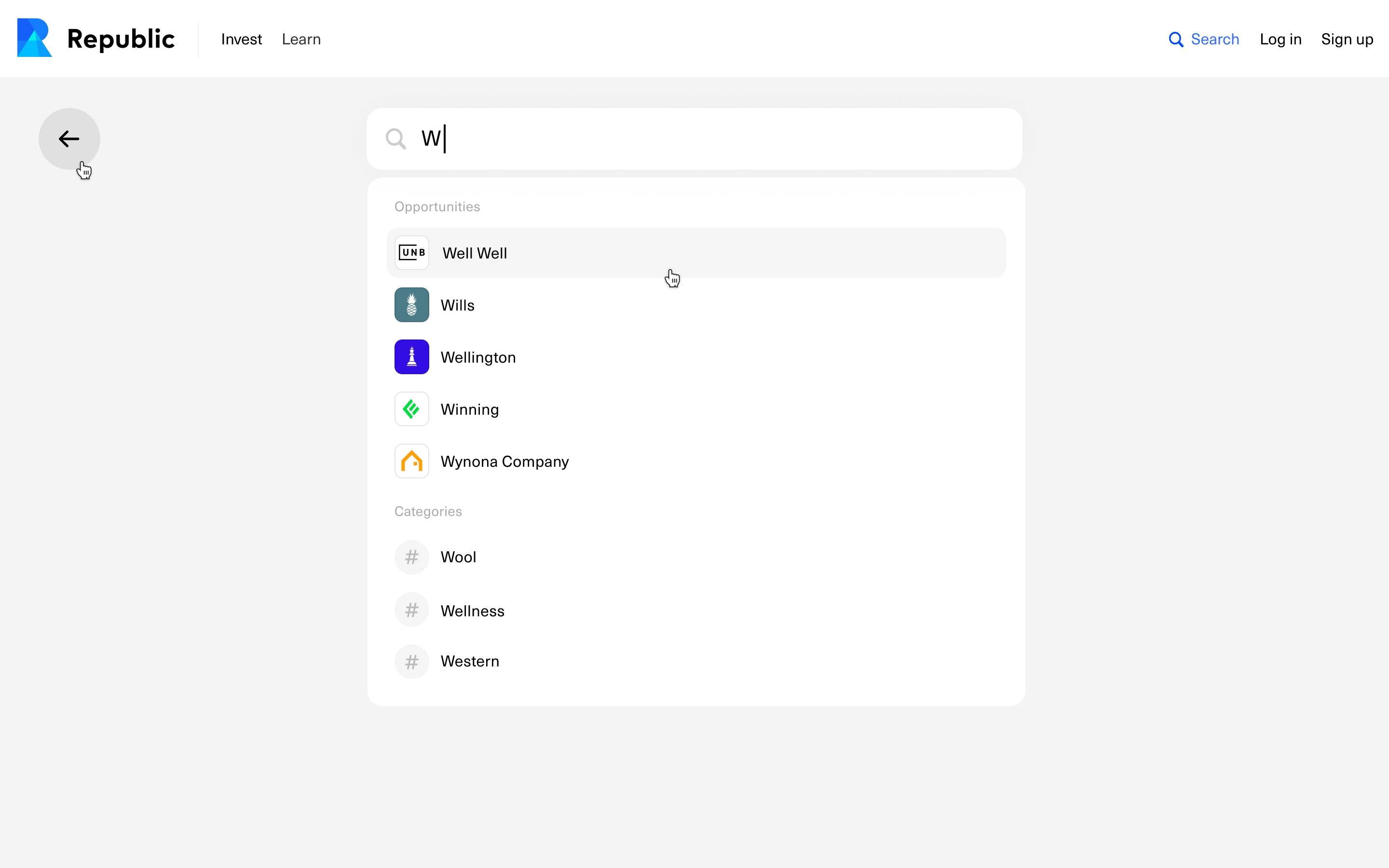 Final Search Designs
Project 3: Privacy Settings
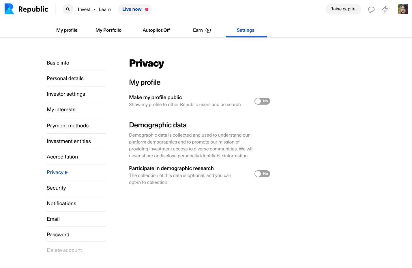 Privacy Settings with all settings off
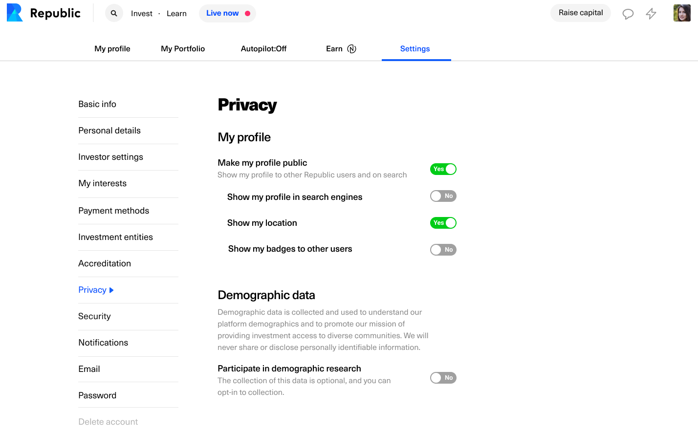
Privacy Settings with some settings on
I also designed the pop-ups/flashbar to notify users that their profiles will now be searchable through the new global search. The original pop-up design included a toggle where the user could decide whether or not their profile would be public, however after discussing complexities of that implementation with our engineers, we decided
Republic recently acquired a company in the UK and is starting to serve European customers. Since users will be searchable in our new search interface, we had to design privacy settings to ensure GDPR compliance. I worked with our Data and Privacy Director to make sure the messaging and functionality was compliant and accessible, and talked with our engineers about implementation.
The privacy settings at the time page did not allow users to customize their settings much, and was relatively vague. I redesigned the user privacy settings to be more straightforward, allowing users better control over their profile and information. If users make their profile private, they automatically don’t share any of their information on their profile. If a user makes their profile public, they have the ability to customize what information others can see. Users can also opt out of sharing demographic data.
![]()
Privacy Settings Change Flashbar
The privacy settings at the time page did not allow users to customize their settings much, and was relatively vague. I redesigned the user privacy settings to be more straightforward, allowing users better control over their profile and information. If users make their profile private, they automatically don’t share any of their information on their profile. If a user makes their profile public, they have the ability to customize what information others can see. Users can also opt out of sharing demographic data.

Privacy Settings Change Flashbar